Are you expecting a baby or do you need to change the kid’s room décor and feel? The first thing you’ll probably think of is what colour scheme you will go for. If your child is over two, then his opinion will be important. But before you settle on an all pink or blue room, try suggesting matching colours so you can explore a few interesting colour combinations. You could print out lots of different colours and have a pleasant time together mixing and matching! You and your child might be surprised of how good some colours look together, maybe a few that weren’t that obvious. Once you’ve decided on the colour scheme, it’s all about getting the right balance. Children are highly emotional, so colours can either inspire, excite, heal, soothe, calm, depress or even agitate. So the importance of choosing the right colours shouldn’t be underestimated.
We did some research on what psychologists for children had to say about the matter and the known effects noticed by parents that might help you.
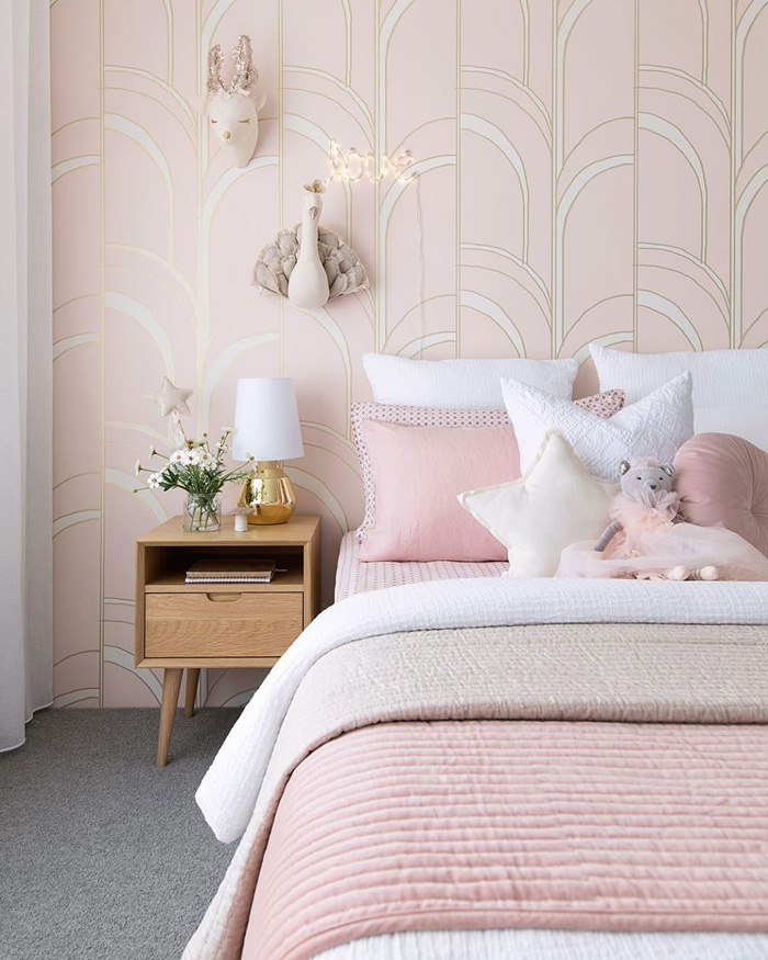
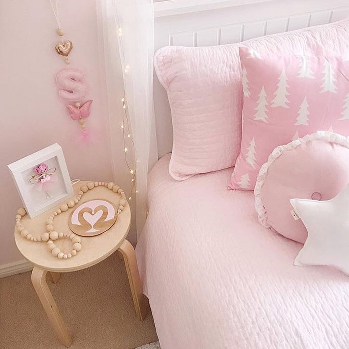
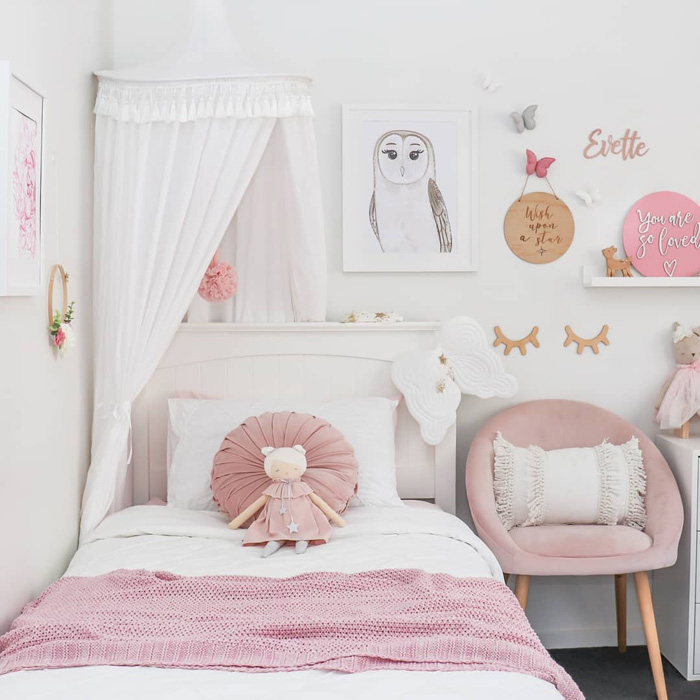
PINK
- associated with feminity and sweetness
- increases a sense of comfort and calm
- can reduce an angry behavior
- can quickly be outgrown, as it has a childlike appeal, so be careful how you dose it
- too much pink can create feelings of irritation and nervousness
@ohd.eight.oh.nine
@sweethomestyling
@these.moments.of.mine
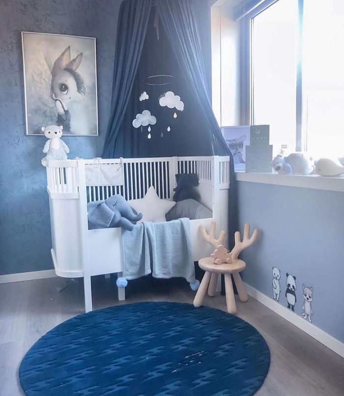
BLUE
- an ideal colour for children with behavioral problems as it has a soothing and calming effect
- makes children feel more spiritual and centered
- improves productivity
- be careful of not going overboard; too much blue (especially darker tones) can have a depressing effect

@design_soda_ruthie
@madelen88
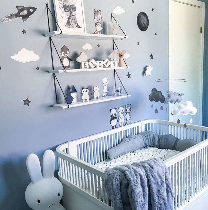
@madelen88
korbo.se
RED
- a warm, stimulating colour
- can increase focus (therefore it’s often a popular accent colour in classrooms)
- too much red can have the opposite effect; inability to focus
- not the ideal colour for a restless child, as it energizes the body and excites the mind
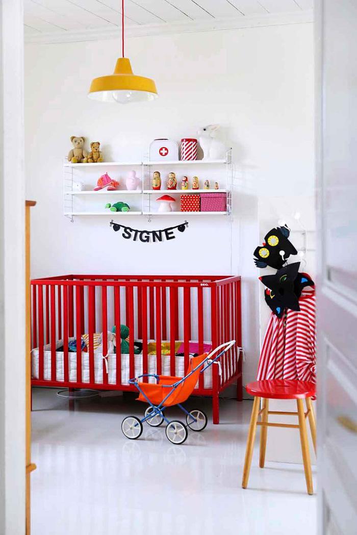
meillakotona.fi
hemtrevligt.se
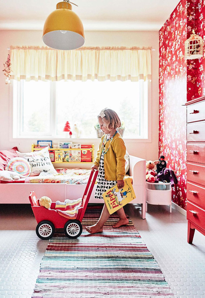
YELLOW
- adds an upbeat and sunny vibe
- associated with happiness, positivity and well-being
- brighter tones can increase memory
- softer tones helps concentration
- large doses can create feelings of agitation
- can cause eye fatigue if the tones are too vivid and bright
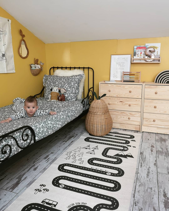
@legangdesetoiles
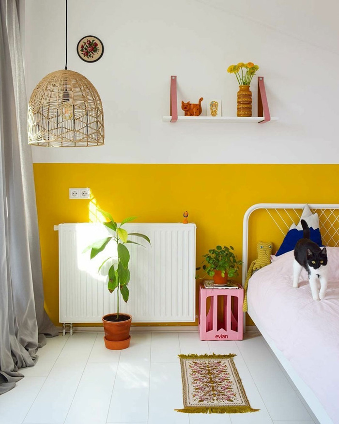
@tikkieretro
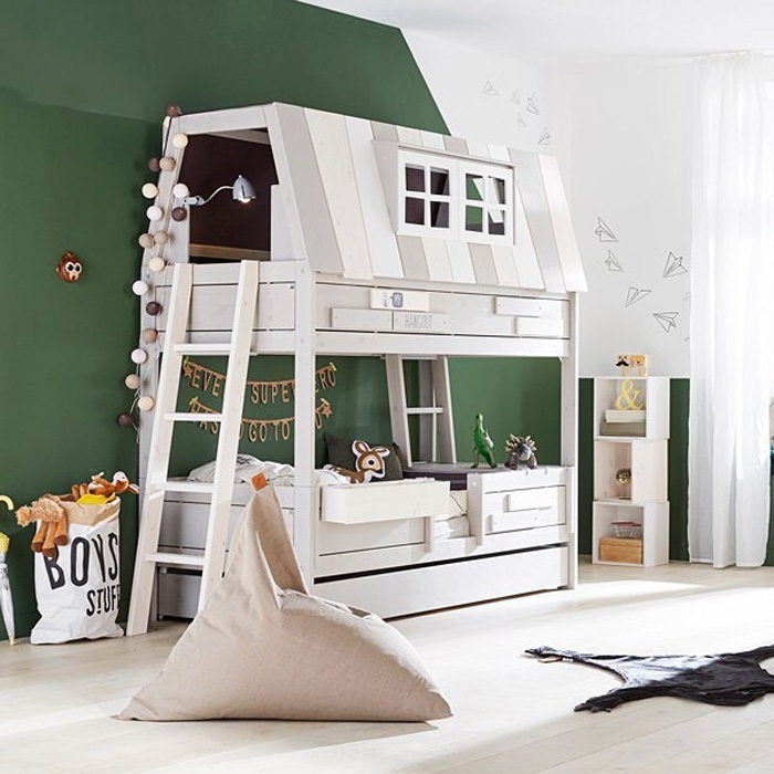
GREEN
- evokes nature and serenity
- has a calming effect
- reduces anxiety
- can increase reading ability and comprehension
- a forest green can feel overwhelming and should be used in accents only
@emiliatrochimiak
@lifetime_kidsrooms
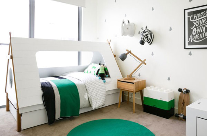
@littleliberty
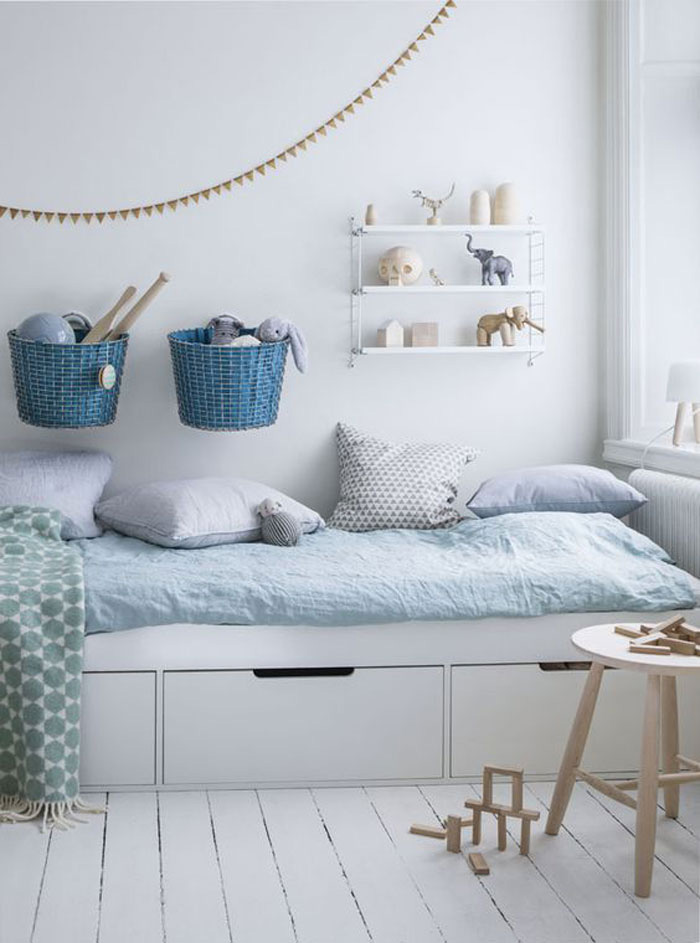
GREY
- enhances creativity
- a great colour when used as a backdrop for colour accents
- if used as a dominant colour, can lead to feelings of loneliness
- balances brighter colours
- gives a sense of security
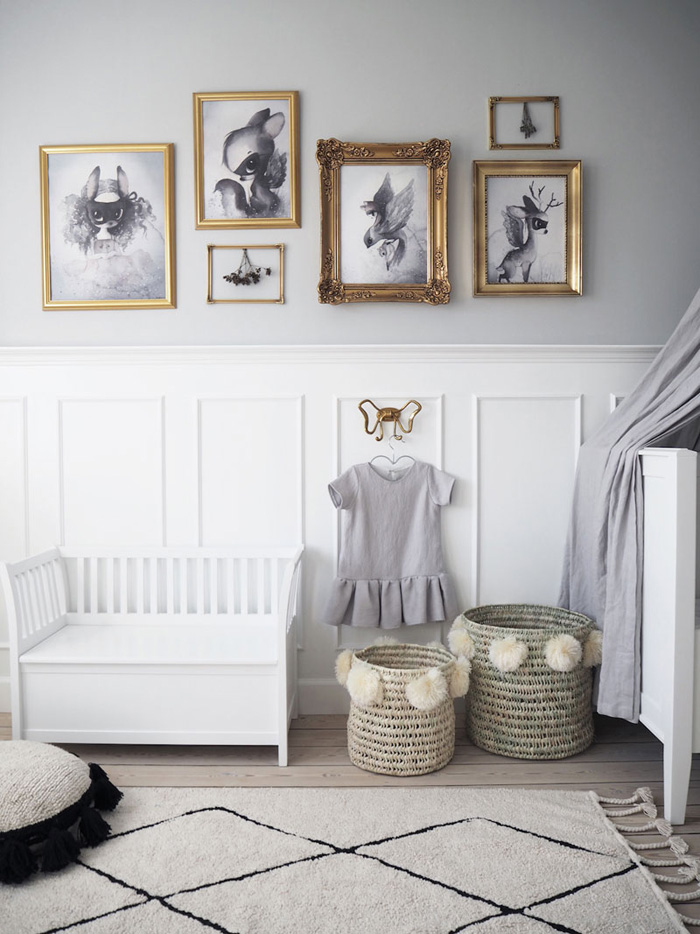
rosemille.dk
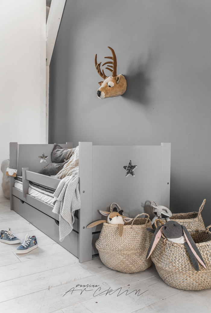
paulinaarcklin.net
@stephanievanvuuren
BLACK
- a sophisticated colour which looks very modern
- can make the room feel smaller
- draws out submissiveness
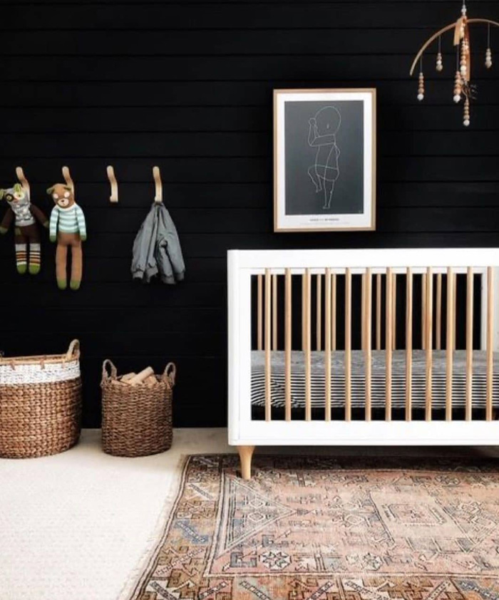
@affordabledesignsolutions
PURPLE
- often associated with luxury and creativity
- lighter shades, such as lavender, adds a calming quality
- inspires sensitivity and compassion in children
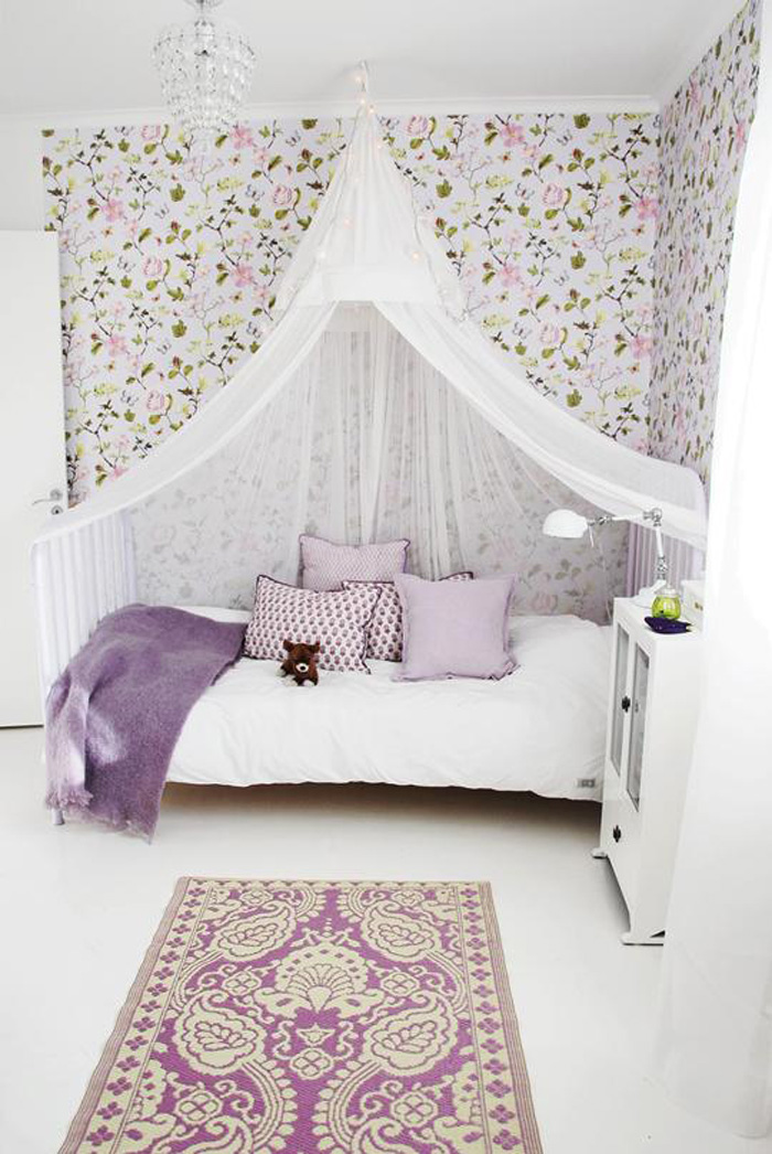
houseofphilia.elsasentourage.se
At the end of the day, it’s important to choose colours that will fit into the family home’s style and that both you and your child will like it. Keep in mind that all children are different, so these guidelines don’t apply to all. To be on the safe side, avoid painting all four walls in the same dominant colour – one painted wall will make all the difference. You can also completely transform the mood in a nursery or kid’s room by adding pops of colours, just by changing the cushions or blankets for example.
Our colour boards on Pinterest can help you look for these décor accents!
YOU MAY ALSO LIKE
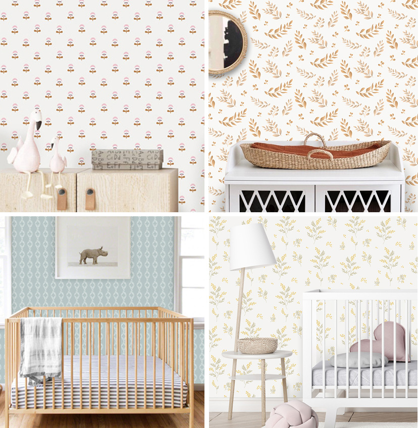
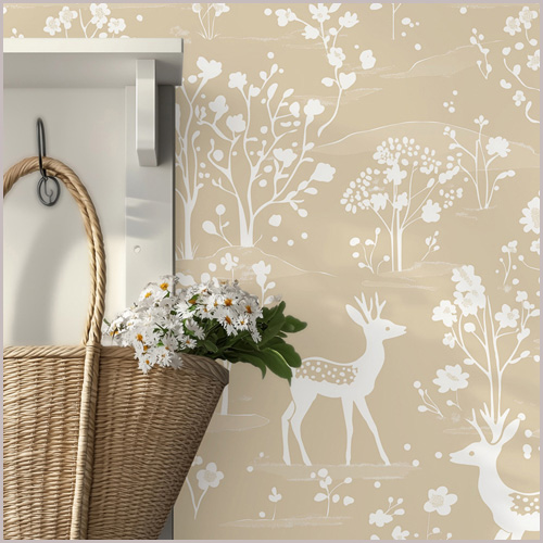
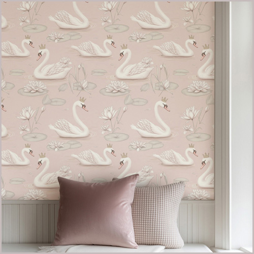
our wallpapers for nursery and kids’ rooms


Trackbacks/Pingbacks